Maquarie University
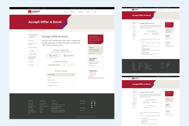
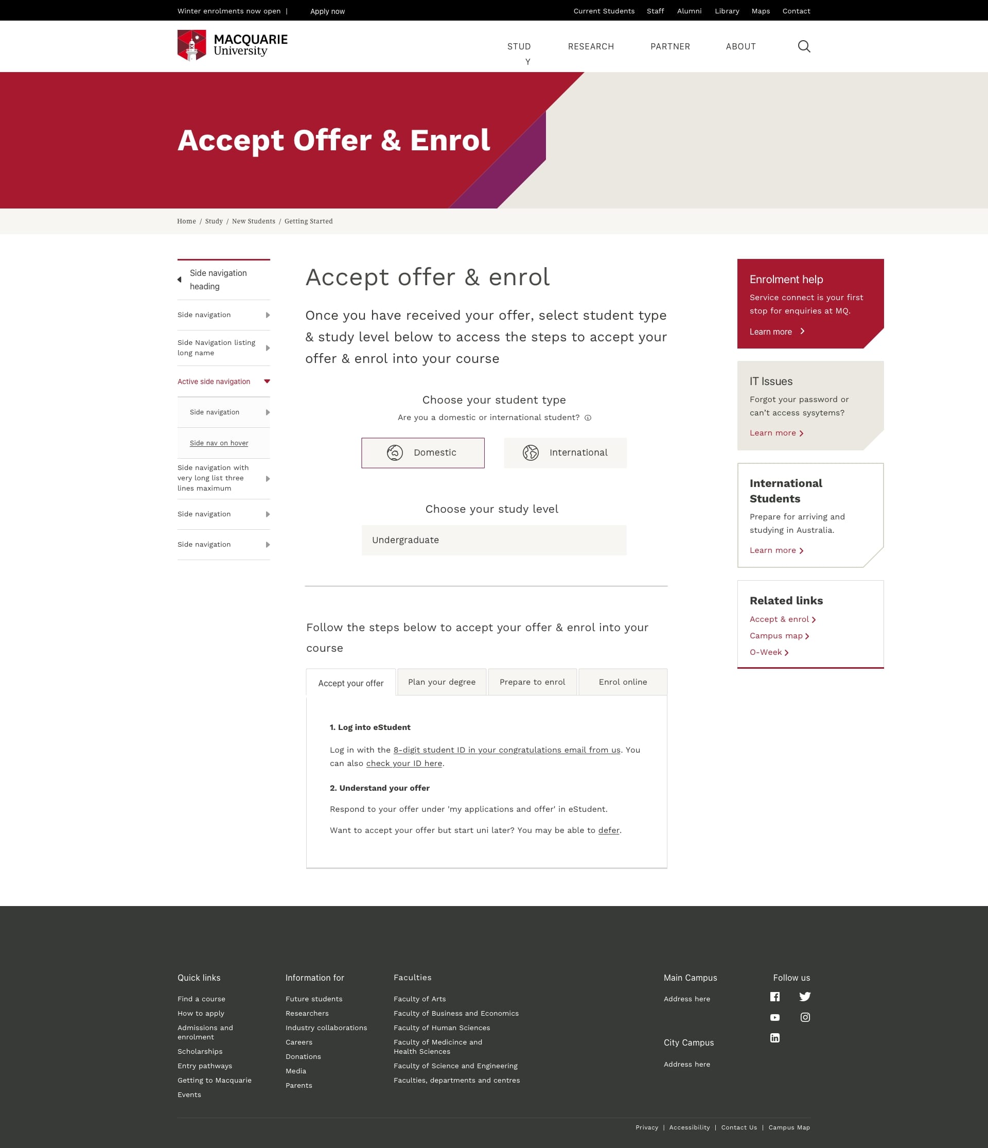
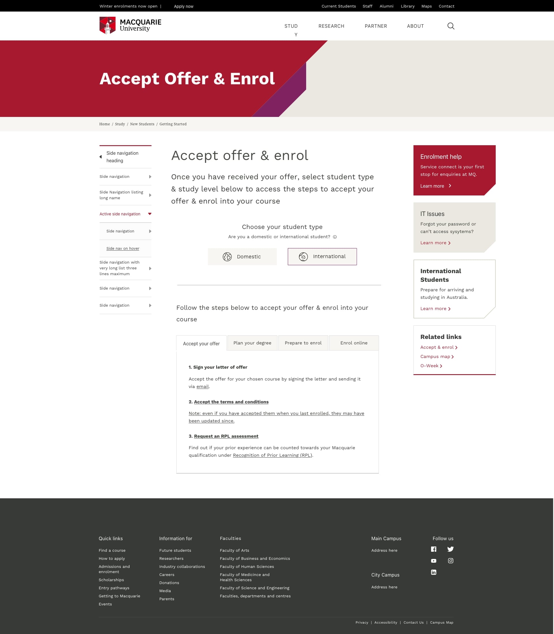
Redesigning the enrollment webpage to serve as a single source of truth and ensure consistency across all service channels
Services
Website Redesign
Industry
Education
My Role
UX UI Designer
Duration
09/2022 11/2022
Challenge
The existing enrolling system is confusing and problematic. Following are some of the main issues:
- The current student enrolling system and service touch points do not follow a logical flow. Communications among different service channels are disconnected, e.g. comms communication does't align with the information on university website.
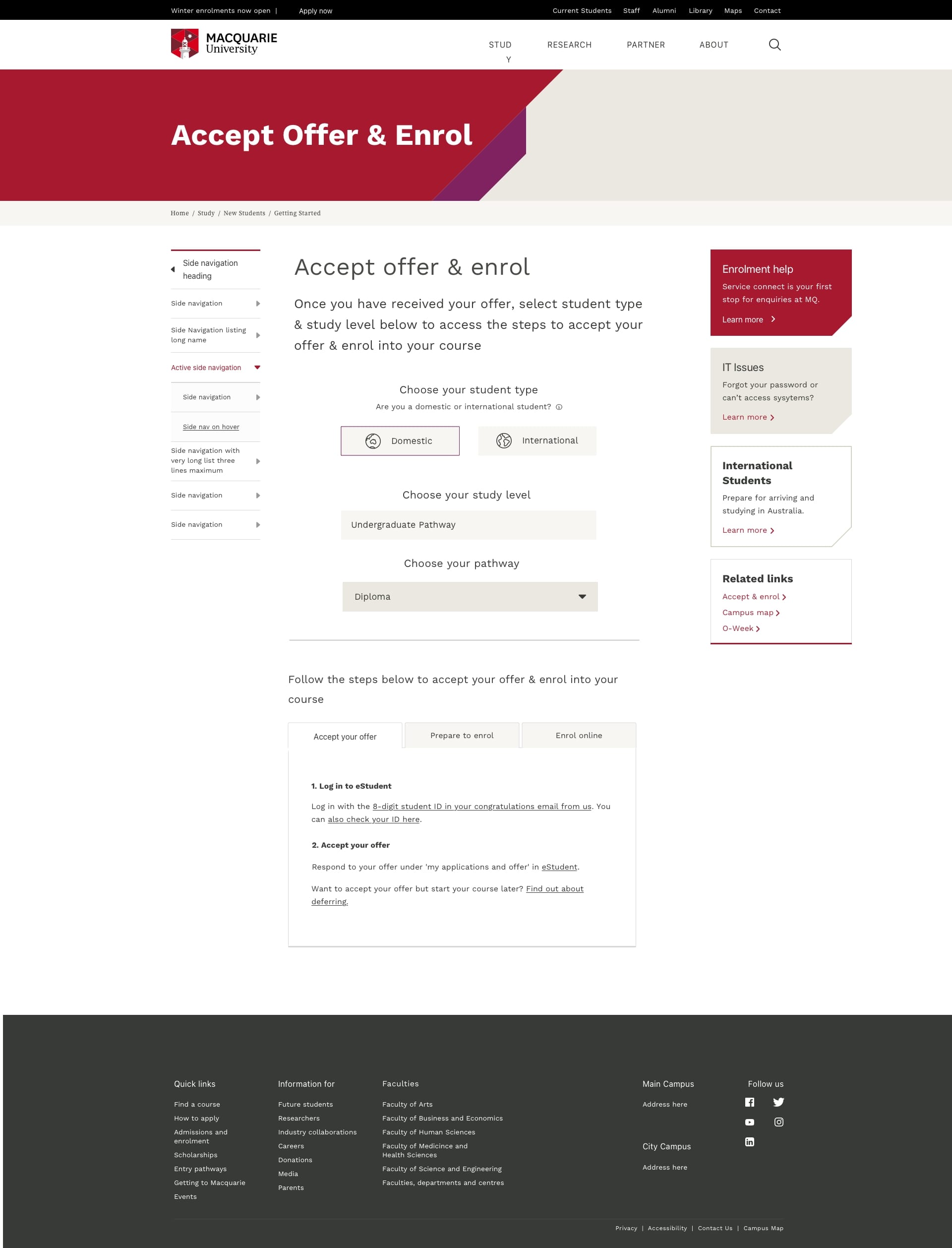
- A step-by-step guide to facilitate new students with a smooth accepting offer & enrolling experience is missing.
- Redundant information on university website. There are 6 webpages about enrolment and many of them have duplicated information as the webpages are updated by different departments.
- University website for current students lacks of effective information hierarchy and is difficult to navigate
How might we create a single source of truth & align information communicated through multiple service channels?

Discovery
Through foundational user research, codesign workshops with staff from multiple departments, we streamlined the user journey and various university service touch points, and therefore, and we analysed the potential gap between the current state ("as-is") and the desired future state ("to-be"). As a result, one of the main insights that were discovered is the existing Macquarie website lacks a step-by-step guide that would help to navigate incoming students to follow.
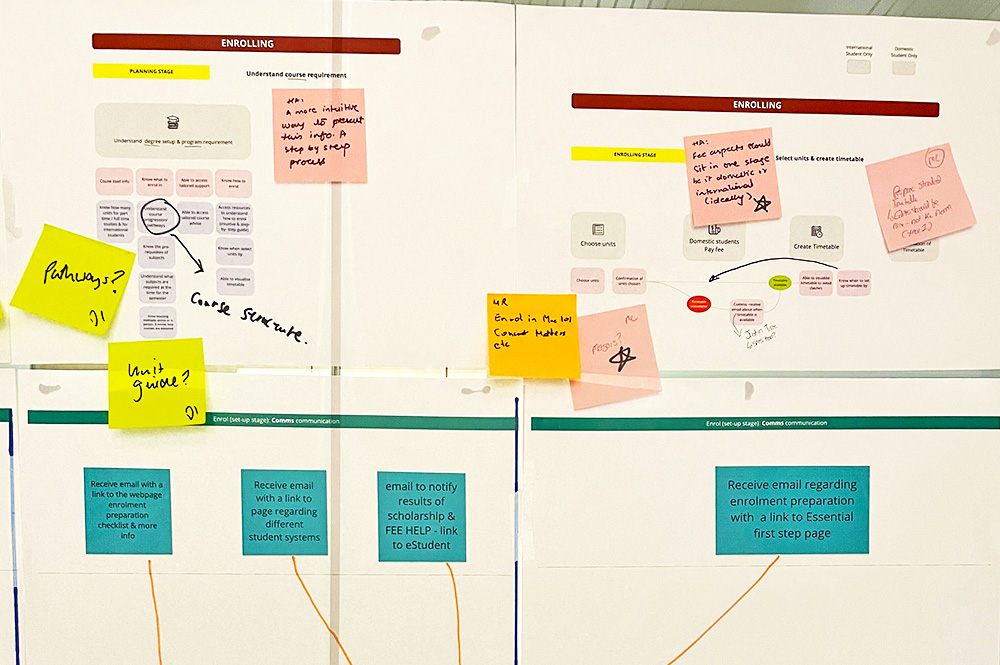
↑ Codesign Workshop
Development
Design Objective:
- Create a repository of enrolment information built in one page
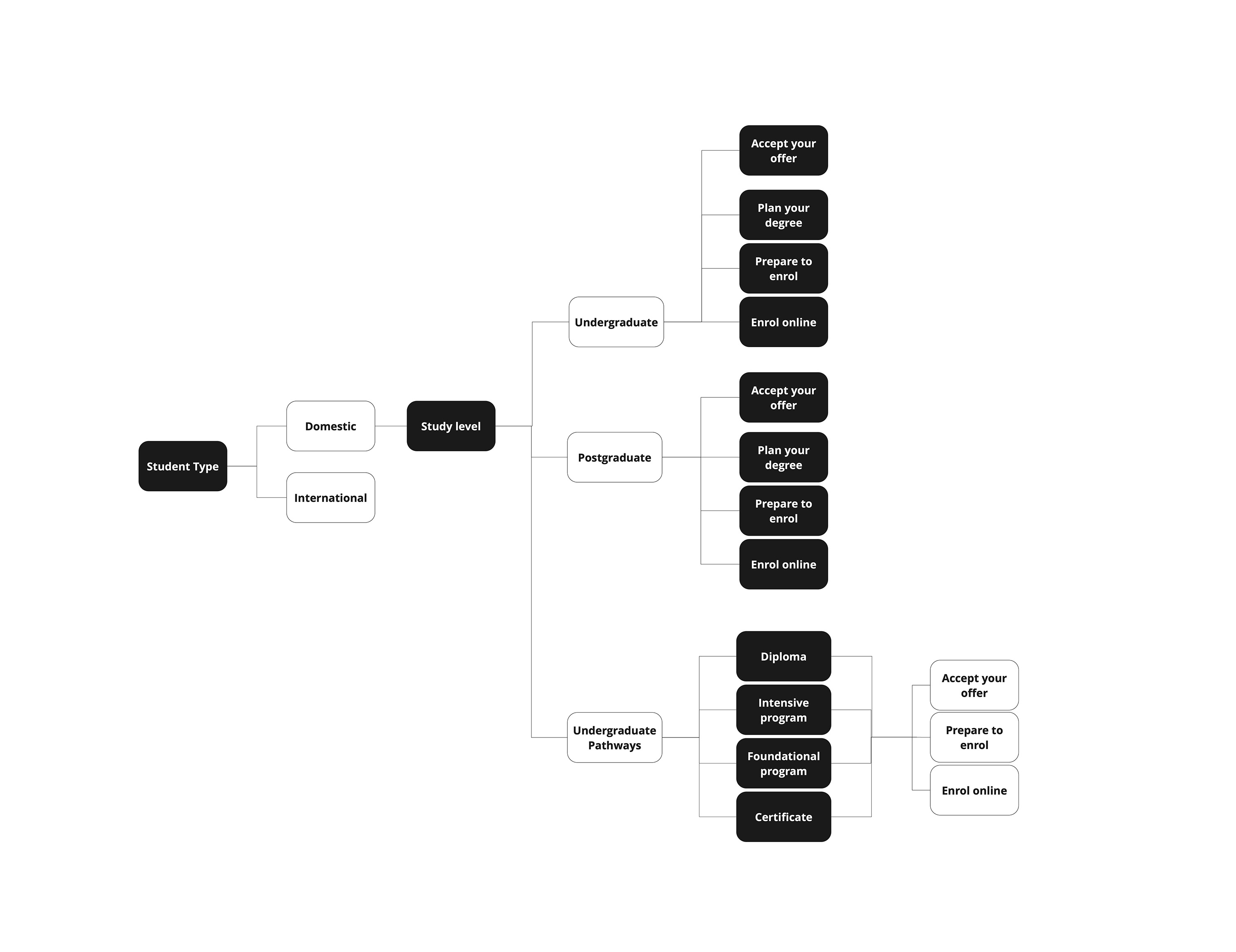
- Improve Information Architecture of website to create a logical flow of content
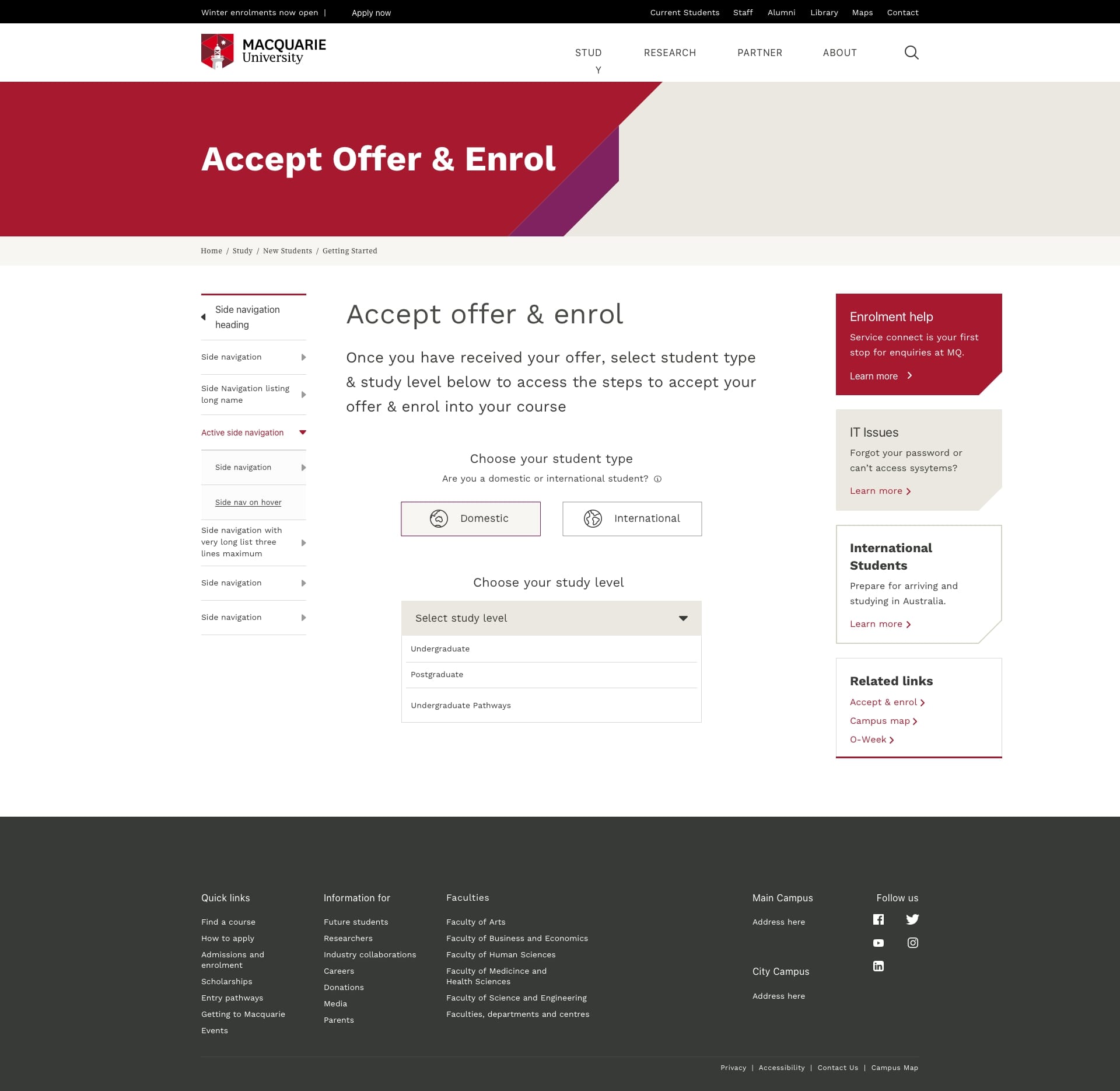
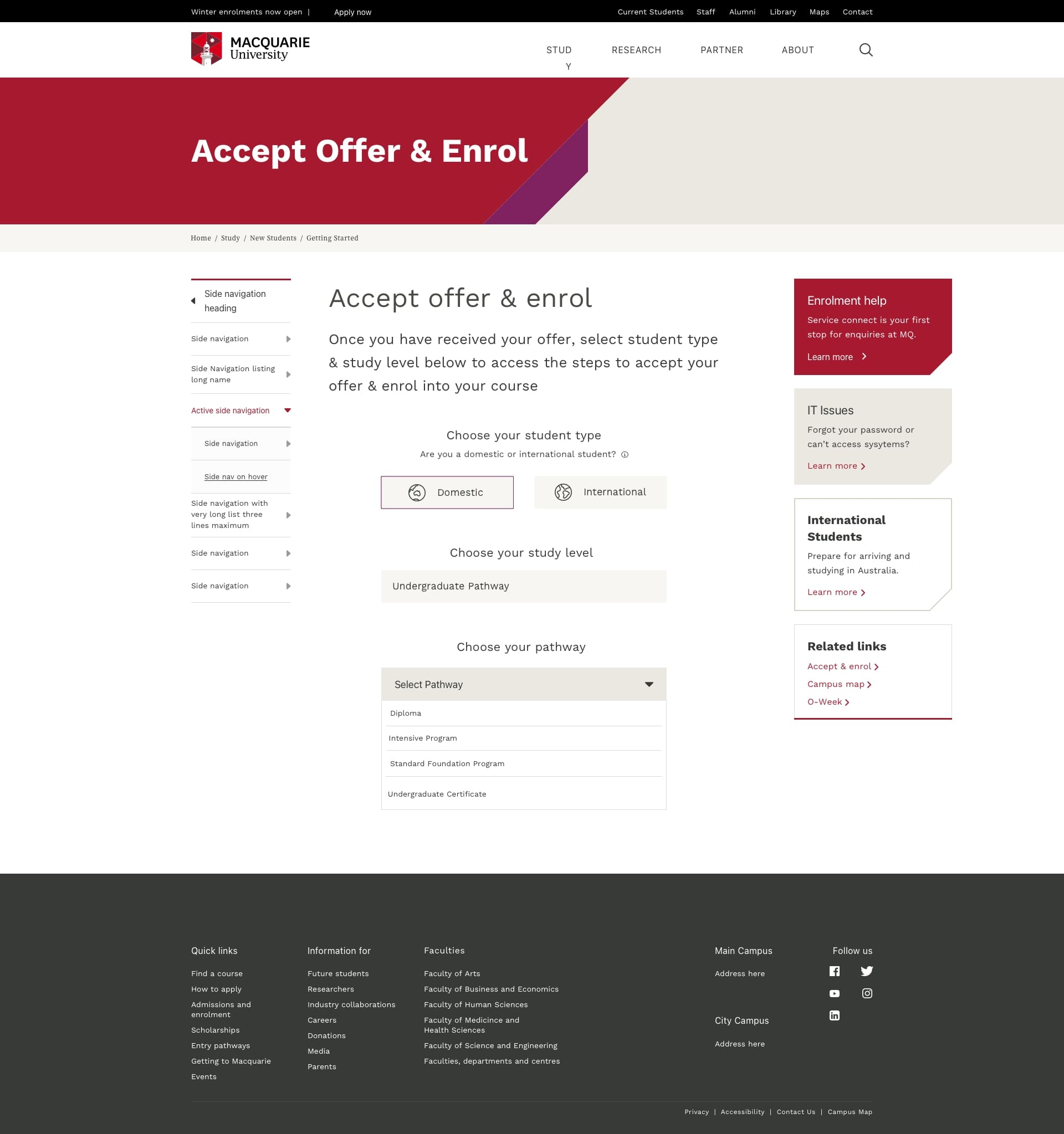
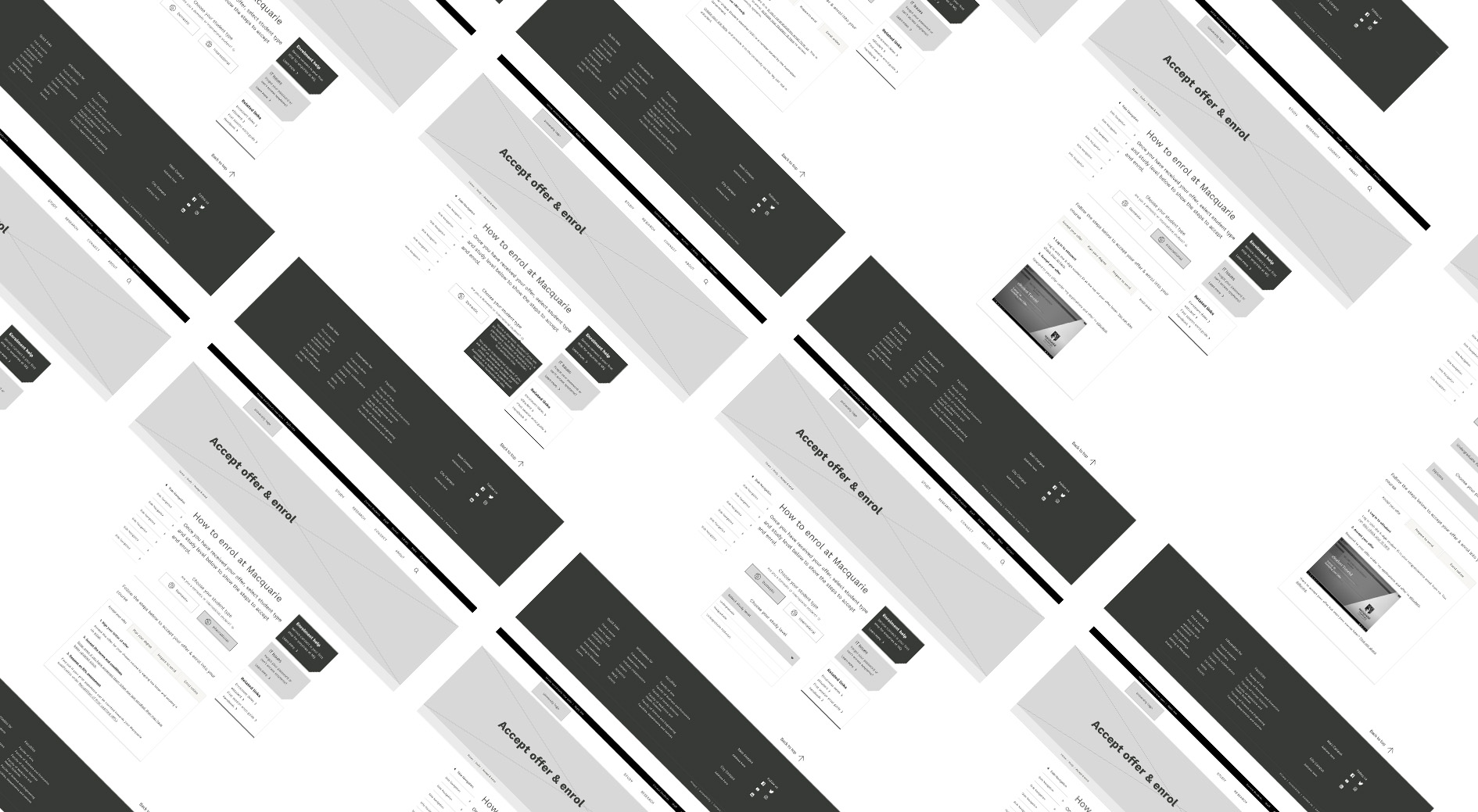
- Creat a step-by-step guide that is easy to navigate and design components that clearly indicate the steps
Usability Testing
After creating initial wireframes, we conducted 6 usability testing sessions to test our prototypes with current Macquarie students to gather their feedback. Through which, we identified the areas in webpage IA & layout that do not make sense to users, uncovered cognitive barriers users may have interacting with the content hierarchy of the page, and gathered user feedback and recommendations.
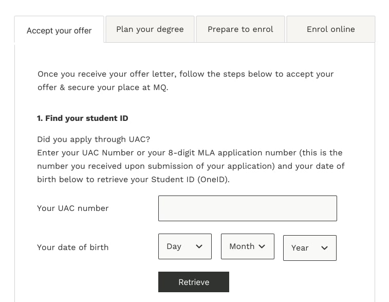
↑ BEFORE
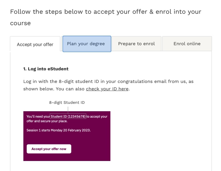
↑ AFTER: Added visual cue to guide users to find student ID on MQ offer email & embeded 'retrieve your ID' function to ensure a clean design & concise content.
Outcome
The project resulted in a streamlined, user-centered enrollment system that greatly improved the student onboarding experience at Macquarie University. By creating a centralized repository of enrollment information and improving the website's information architecture, we eliminated redundant content and established a logical flow of communication across multiple service channels. The new step-by-step guide now offers a clear, easy-to-navigate pathway for incoming students to accept offers and enroll successfully.
